Tutorial
ldcpy is a utility for gathering and plotting derived quantities from NetCDF or Zarr files using the Pangeo stack. This tutorial notebook targets comparing CESM data in its original form to CESM data that has undergone lossy compression (meaning that the reconstructed file is not exactly equivalent to the original file). The tools provided in ldcpy are intended to highlight differences due to compression artifacts in order to assist scientist in evaluating the amount of lossy compression to apply to their data.
The CESM data used here are NetCDF files in “timeseries” file format, meaning that each NetCDF file contains one (major) output variable (e.g., surface temperature or precipitation rate) and spans multiple timesteps (daily, monthly, 6-hourly, etc.). CESM timeseries files are regularly released in large public datasets.
On NCAR’s Jupyterhub, environment NPL 2023a is a good option.
[1]:
# Add ldcpy root to system path
import sys

sys.path.insert(0, '../../../')

# Import ldcpy package
# Autoreloads package everytime the package is called, so changes to code will be reflected in the notebook if the above sys.path.insert(...) line is uncommented.
%load_ext autoreload
%autoreload 2

# suppress all of the divide by zero warnings
import warnings

warnings.filterwarnings("ignore")

import ldcpy

# display the plots in this notebook
%matplotlib inline
Overview
This notebook demonstrates the use of ldcpy on the sample data included with this package. It explains how to open datasets (and view metadata), display basic statistics about the data, and create both time-series and spatial plots of the datasets and related quantitiess. Plot examples start out with the essential arguments, and subsequent examples explore the additional plotting options that are available.
For information about installation, see these instructions, and for information about usage, see the API reference here.
Loading Datasets and Viewing Metadata
The first step in comparing the data is to load the data from the files that we are interested into a “collection” for ldcpy to use. To do this, we use ldcpy.open_datasets(). This function requires the following three arguments:
varnames : the variable(s) of interest to combine across files (typically the timeseries file variable name)
list_of_files : a list of full file paths (either relative or absolute)
labels : a corresponding list of names (or labels) for each file in the collection
Note: This function is a wrapper for xarray.open_mfdatasets(), and any additional key/value pairs passed in as a dictionary are used as arguments to xarray.open_mfdatasets(). For example, specifying the chunk size (“chunks”) will be important for large data (see LargeDataGladeNotebook.ipynb for more information and an example).
We setup three different collections of timeseries datasets in these examples:
col_ts contains daily surface temperature (TS) data (2D data) for 100 days
col_prect contains daily precipitation rate (PRECT) data (2D data) for 60 days
col_t contains monthly temperature (T) data (3D data) for 3 months
These datasets are collections of variable data from several different netCDF files, which are given labels in the third parameter to the ldcpy.open_datasets() function. These names/labels can be whatever you want (e.g., “orig”, “control”, “bob”, …), but they should be informative because the names will be used to select the appropriate dataset later and as part of the plot titles.
In this example, in each dataset collection we include a file with the original (uncompressed) data as well as additional file(s) with the same data subject to different levels of lossy compression.
Note: If you do not need to get the data from files (e.g., you have already used xarray.open_dataset()), then use ldcpy.collect_datasets() instead of ldcpy.open_datasets (see example in AWSDataNotebook.ipynb).
[2]:
# col_ts is a collection containing TS data
col_ts = ldcpy.open_datasets(
    "cam-fv",
    ["TS"],
    [
        "../../../data/cam-fv/orig.TS.100days.nc",
        "../../../data/cam-fv/zfp1.0.TS.100days.nc",
        "../../../data/cam-fv/zfp1e-1.TS.100days.nc",
    ],
    ["orig", "zfpA1.0", "zfpA1e-1"],
)
# col_prect contains PRECT data
col_prect = ldcpy.open_datasets(
    "cam-fv",
    ["PRECT"],
    [
        "../../../data/cam-fv/orig.PRECT.60days.nc",
        "../../../data/cam-fv/zfp1e-7.PRECT.60days.nc",
        "../../../data/cam-fv/zfp1e-11.PRECT.60days.nc",
    ],
    ["orig", "zfpA1e-7", "zfpA1e-11"],
)
# col_t contains 3D T data (here we specify the chunk to be a single timeslice)
col_t = ldcpy.open_datasets(
    "cam-fv",
    ["T"],
    [
        "../../../data/cam-fv/cam-fv.T.3months.nc",
        "../../../data/cam-fv/c.fpzip.cam-fv.T.3months.nc",
    ],
    ["orig", "comp"],
    chunks={"time": 1},
)
dataset size in GB 0.07

dataset size in GB 0.04

dataset size in GB 0.04
Note that running the open_datasets function (as above) prints out the size of each dataset collection. For col_prect , the chunks parameter is used by DASK (which is further explained in LargeDataGladeNotebook.ipynb).
Printing a dataset collection reveals the dimension names, sizes, datatypes and values, among other metadata. The dimensions and the length of each dimension are listed at the top of the output. Coordinates list the dimensions vertically, along with the data type of each dimension and the coordinate values of the dimension (for example, we can see that the 192 latitude data points are spaced evenly between -90 and 90). Data variables lists all the variables available in the dataset. For these timeseries files, only the one (major) variable will be of interest. For col_t , that variable is temperature (T), which was specified in the first argument of the open_datasets() call. The so-called major variable will have the required “lat”, “lon”, and “time” dimensions. If the variable is 3D (as in this example), a “lev” dimension will indicates that the dataset contains values at multiple altitudes (here, lev=30). Finally, a “collection” dimension indicates that we concatenated several datasets together. (In this col_t example, we concatonated 2 files together.)
[3]:
# print info about col_t
col_t
[3]:
<xarray.Dataset> Size: 41MB
Dimensions:     (collection: 2, time: 3, lev: 30, lat: 192, lon: 288)
Coordinates:
  * lat         (lat) float64 2kB -90.0 -89.06 -88.12 ... 88.12 89.06 90.0
  * lev         (lev) float64 240B 3.643 7.595 14.36 24.61 ... 957.5 976.3 992.6
  * lon         (lon) float64 2kB 0.0 1.25 2.5 3.75 ... 355.0 356.2 357.5 358.8
  * time        (time) object 24B 1920-02-01 00:00:00 ... 1920-04-01 00:00:00
    cell_area   (lat, collection, lon) float64 885kB dask.array<chunksize=(192, 1, 288), meta=np.ndarray>
  * collection  (collection) <U4 32B 'orig' 'comp'
Data variables:
    T           (collection, time, lev, lat, lon) float32 40MB dask.array<chunksize=(1, 1, 15, 96, 144), meta=np.ndarray>
Attributes: (12/16)
    Conventions:      CF-1.0
    source:           CAM
    case:             b.e11.B20TRC5CNBDRD.f09_g16.031
    title:            UNSET
    logname:          mickelso
    host:             ys0219
    ...               ...
    history:          Thu Jul  9 14:15:11 2020: ncks -d time,0,2,1 cam-fv.T.6...
    NCO:              netCDF Operators version 4.7.9 (Homepage = http://nco.s...
    cell_measures:    area: cell_area
    data_type:        cam-fv
    file_size:        {'orig': 10622798, 'comp': 2994433}
weighted: TrueComparing Summary Statistics
The compare_stats function can be used to compute and compare the overall statistics for a single timeslice in two (or more) datasets from a collection. To use this function, three arguments are required. In order, they are:
ds - a single time slice in a collection of datasets read in from ldcpy.open_datasets() or ldcpy.collect_datasets()
varname - the variable name we want to get statistics for (in this case ‘TS’ is the variable in our dataset collection col_ts )
sets - the labels of the datasets in the collection we are interested in cpmparing (if more than two, all are compare to he first one)
Additionally, three optional arguments can be specified:
significant_digits - the number of significant digits to print (default = 5)
include_ssim - include the image ssim (default = False. Note this takes a bit of time for 3D vars)
weighted - use weighted averages (default = True)
[4]:
# print 'TS' statistics about 'orig', 'zfpA1.0', and 'zfpA1e-1 and diff between the 'orig' and the other two datasets
# for time slice = 0
ds = col_ts.isel(time=0)
ldcpy.compare_stats(
    ds, "TS", ["orig", "zfpA1.0", "zfpA1e-1"], significant_digits=6, aggregate_dims=["lat", "lon"]
)
| orig | zfpA1.0 | zfpA1e-1 | |
|---|---|---|---|
| mean | 284.49 | 284.481 | 284.489 |
| variance | 329.95 | 329.798 | 329.939 |
| standard deviation | 18.1645 | 18.1604 | 18.1642 |
| min value | 216.741 | 216.816 | 216.747 |
| min (abs) nonzero value | 216.741 | 216.816 | 216.747 |
| max value | 315.584 | 315.57 | 315.576 |
| probability positive | 1 | 1 | 1 |
| number of zeros | 0 | 0 | 0 |
| 99% real information cutoff bit | 18 | 25 | 29 |
| spatial autocorr - latitude | 0.993918 | 0.993911 | 0.993918 |
| spatial autocorr - longitude | 0.996801 | 0.996791 | 0.996801 |
| entropy estimate | 0.414723 | 0.247491 | 0.347534 |
| zfpA1.0 | zfpA1e-1 | |
|---|---|---|
| max abs diff | 0.405884 | 0.0229187 |
| min abs diff | 0 | 0 |
| mean abs diff | 0.0565128 | 0.0042215 |
| mean squared diff | 7.32045e-05 | 3.04995e-07 |
| root mean squared diff | 0.0729538 | 0.00532525 |
| normalized root mean squared diff | 0.000761543 | 5.39821e-05 |
| normalized max pointwise error | 0.00410636 | 0.00023187 |
| pearson correlation coefficient | 0.999995 | 1 |
| ks p-value | 1 | 1 |
| spatial relative error(% > 0.0001) | 68.958 | 0 |
| max spatial relative error | 0.00151395 | 9.20176e-05 |
| DSSIM | 0.981813 | 0.998227 |
| file size ratio | 1.87 | 1.28 |
[5]:
# without weighted means
ldcpy.compare_stats(
    ds,
    "TS",
    ["orig", "zfpA1.0", "zfpA1e-1"],
    significant_digits=6,
    weighted=False,
    aggregate_dims=["lat", "lon"],
)
| orig | zfpA1.0 | zfpA1e-1 | |
|---|---|---|---|
| mean | 274.714 | 274.708 | 274.713 |
| variance | 534.006 | 533.681 | 533.985 |
| standard deviation | 23.1088 | 23.1017 | 23.1083 |
| min value | 216.741 | 216.816 | 216.747 |
| min (abs) nonzero value | 216.741 | 216.816 | 216.747 |
| max value | 315.584 | 315.57 | 315.576 |
| probability positive | 1 | 1 | 1 |
| number of zeros | 0 | 0 | 0 |
| 99% real information cutoff bit | 18 | 25 | 29 |
| spatial autocorr - latitude | 0.993918 | 0.993911 | 0.993918 |
| spatial autocorr - longitude | 0.996801 | 0.996791 | 0.996801 |
| entropy estimate | 0.414723 | 0.247491 | 0.347534 |
| zfpA1.0 | zfpA1e-1 | |
|---|---|---|
| max abs diff | 0.405884 | 0.0229187 |
| min abs diff | 0 | 0 |
| mean abs diff | 0.0585202 | 0.00422603 |
| mean squared diff | 3.32617e-05 | 1.51646e-07 |
| root mean squared diff | 0.075273 | 0.00533574 |
| normalized root mean squared diff | 0.000761543 | 5.39821e-05 |
| normalized max pointwise error | 0.00410636 | 0.00023187 |
| pearson correlation coefficient | 0.999995 | 1 |
| ks p-value | 1 | 1 |
| spatial relative error(% > 0.0001) | 68.958 | 0 |
| max spatial relative error | 0.00151395 | 9.20176e-05 |
| DSSIM | 0.981813 | 0.998227 |
| file size ratio | 1.87 | 1.28 |
Spatial Plots
A Basic Spatial Plot
First we demonstrate the most basic usage of the ldcpy.plot() function. In its simplist form, ldcpy.plot() plots a single spatial plot of a dataset (i.e., no comparison) and requires:
ds - the collection of datasets read in from ldcpy.open_datasets() (or ldcpy.collect_datasets())
varname - the variable name we want to get statistics for
sets - a list of the labels of the datasets in the collection that we are interested in
calc - the name of the calculation to be plotted
There are a number of optional arguments as well, that will be demonstrated in subsequent plots. These options include:
group_by
scale
calc_type
plot_type
transform
subset
lat
lon
lev
color
quantile
start
end
A full explanation of each optional argument is available in the documentation here - as well as all available options. By default, a spatial plot of this data is created. The title of the plot contains the name of the dataset, the variable of interest, and the calculation that is plotted.
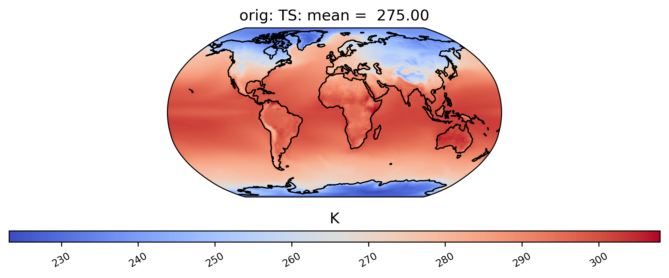
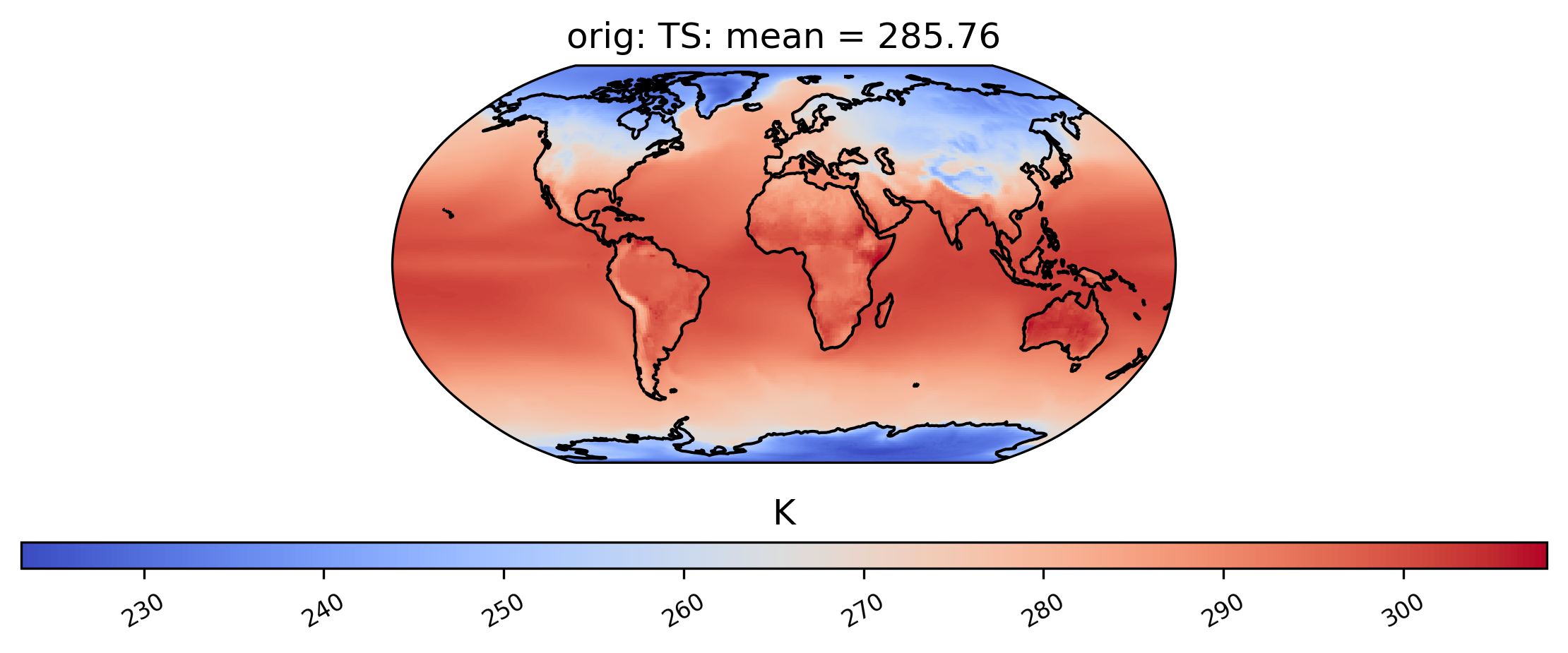
The following command generates a plot showing the mean TS (surface temperature) value from our dataset collection col_ts over time at each point in the dataset labeled ‘orig’. Note that plots can be saved by using the matplotlib function savefig:
[6]:
ldcpy.plot(
    col_ts,
    "TS",
    sets=["orig"],
    calc="mean",
    plot_type="spatial",
)
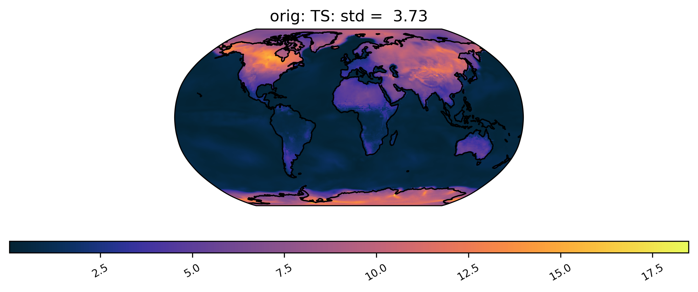
We can also plot quantities other than the mean, such as the standard deviation at each grid point over time. We can also change the color scheme (for a full list of quantitiess and color schemes, see the documentation). Here is an example of a plot of the same dataset from col_ts as above but using a different color scheme and the standard deviation calculation. Notice that we do not specify the ‘plot_type’ this time, because it defaults to ‘spatial’:
[7]:
# plot of the standard deviation of TS values in the col_ds "orig" dataset
ldcpy.plot(col_ts, "TS", sets=["orig"], calc="std", color="cmo.thermal")
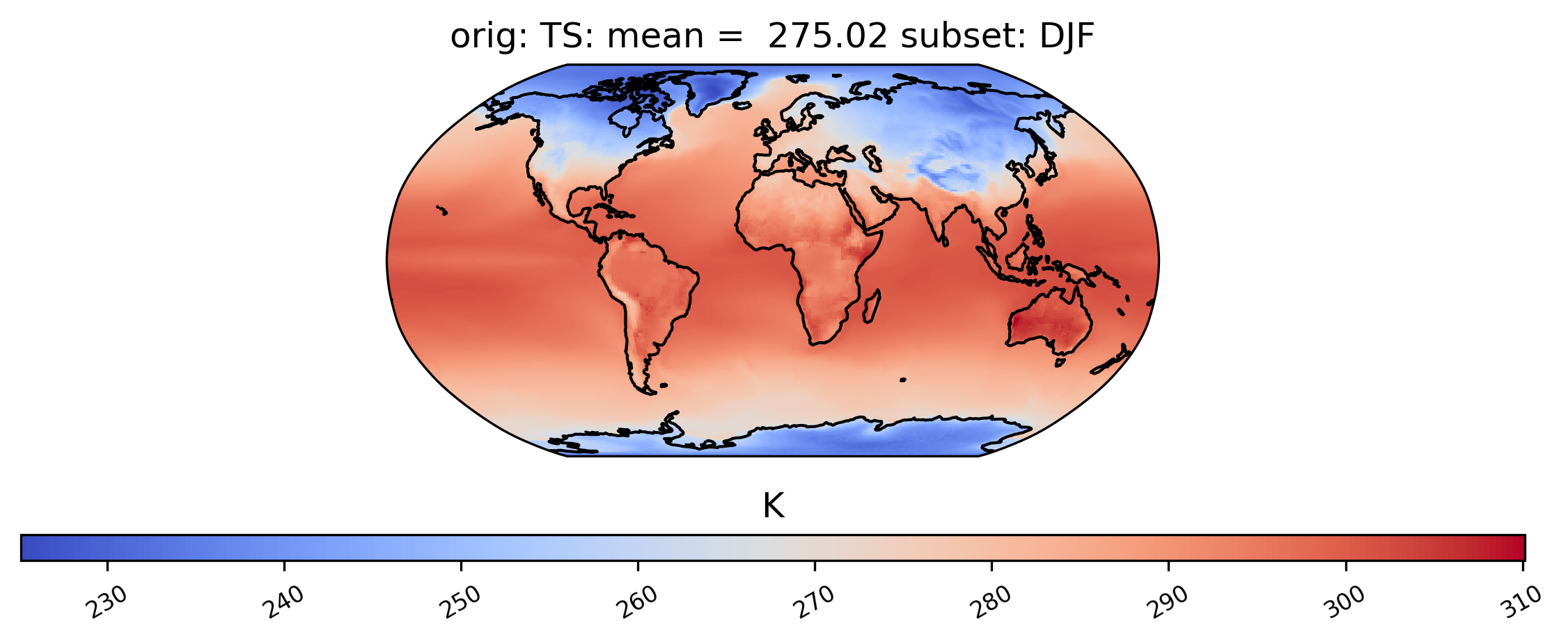
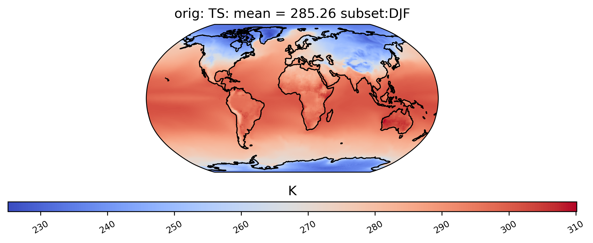
Spatial Subsetting
Plotting a derived quantity of a subset of the data (e.g., not all of the time slices in the dataset) is possible using the subset keyword. In the plot below, we just look at “DJF” data (Dec., Jan., Feb.). Other options for subset are available here.
[8]:
# plot of mean winter TS values in the col_ts "orig" dataset
ldcpy.plot(col_ts, "TS", sets=["orig"], calc="mean", subset="DJF")
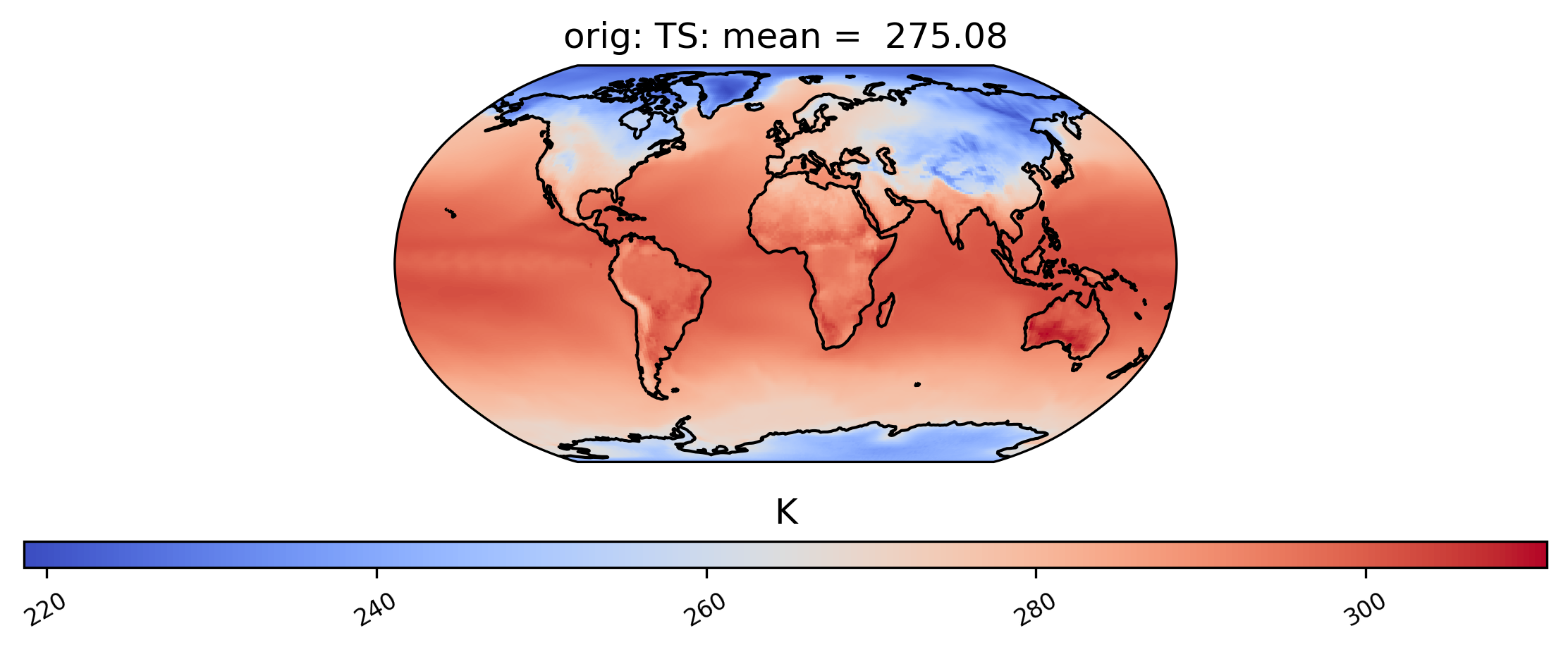
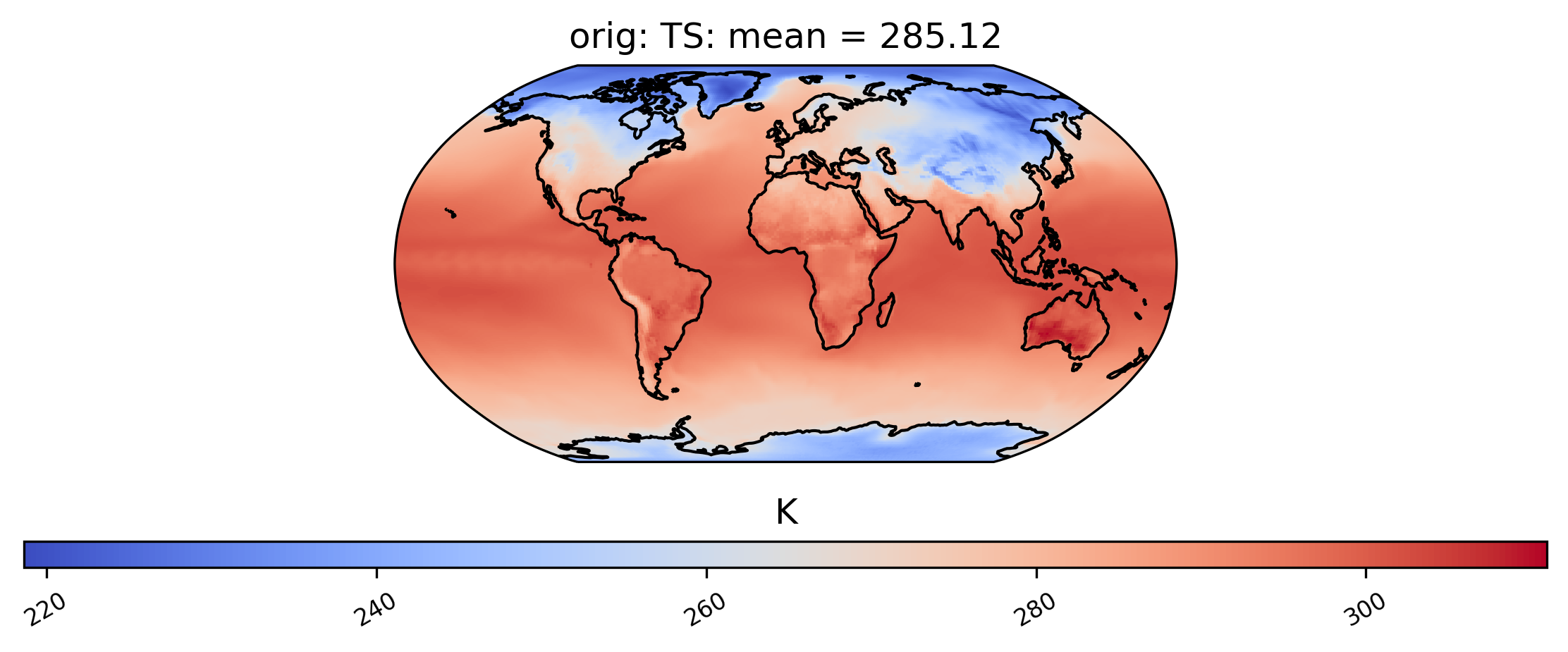
It is also possible to plot calculations for a subset of the time slices by specifying the start and end indices of the time we are interested in. This command creates a spatial plot of the mean TS values in “orig” for the first five days of data:
[9]:
# plot of the first 5 TS values in the ds orig dataset
ldcpy.plot(col_ts, "TS", sets=["orig"], calc="mean", start=0, end=5)
Finally, for a 3D dataset, we can specify which vertical level to view using the “lev” keyword. Note that “lev” is a dimension in our dataset col_t (see printed output for col_t above), and in this case lev=30, meaning that lev ranges from 0 and 29, where 0 is at the surface (by default, lev=0):
[10]:
# plot of T values at lev=29 in the col_t "orig" dataset
ldcpy.plot(col_t, "T", sets=["orig"], calc="variance", lev=29)
Spatial Comparisons and Diff Plots
If we want a side-by-side comparison of two datasets, we need to specify an additional dataset name in the sets argument. The plot below shows the mean TS value over time at each point in the ‘orig’ (original), ‘zfpA1.0’ (compressed with zfp, absolute error tolerance 1.0) and ‘zfpA1e-1’ (compressed with zfp, absolute error tolerance 0.1) datasets in collection col_ts . The “vert_plot” argument inidcates that the arrangent of the subplots should be vertical.
[11]:
# comparison between mean TS values in col_ts for "orig" and "zfpA1.0" datasets
ldcpy.plot(
    col_ts,
    "TS",
    sets=["orig", "zfpA1.0", "zfpA1e-1"],
    calc="mean",
    vert_plot=True,
)
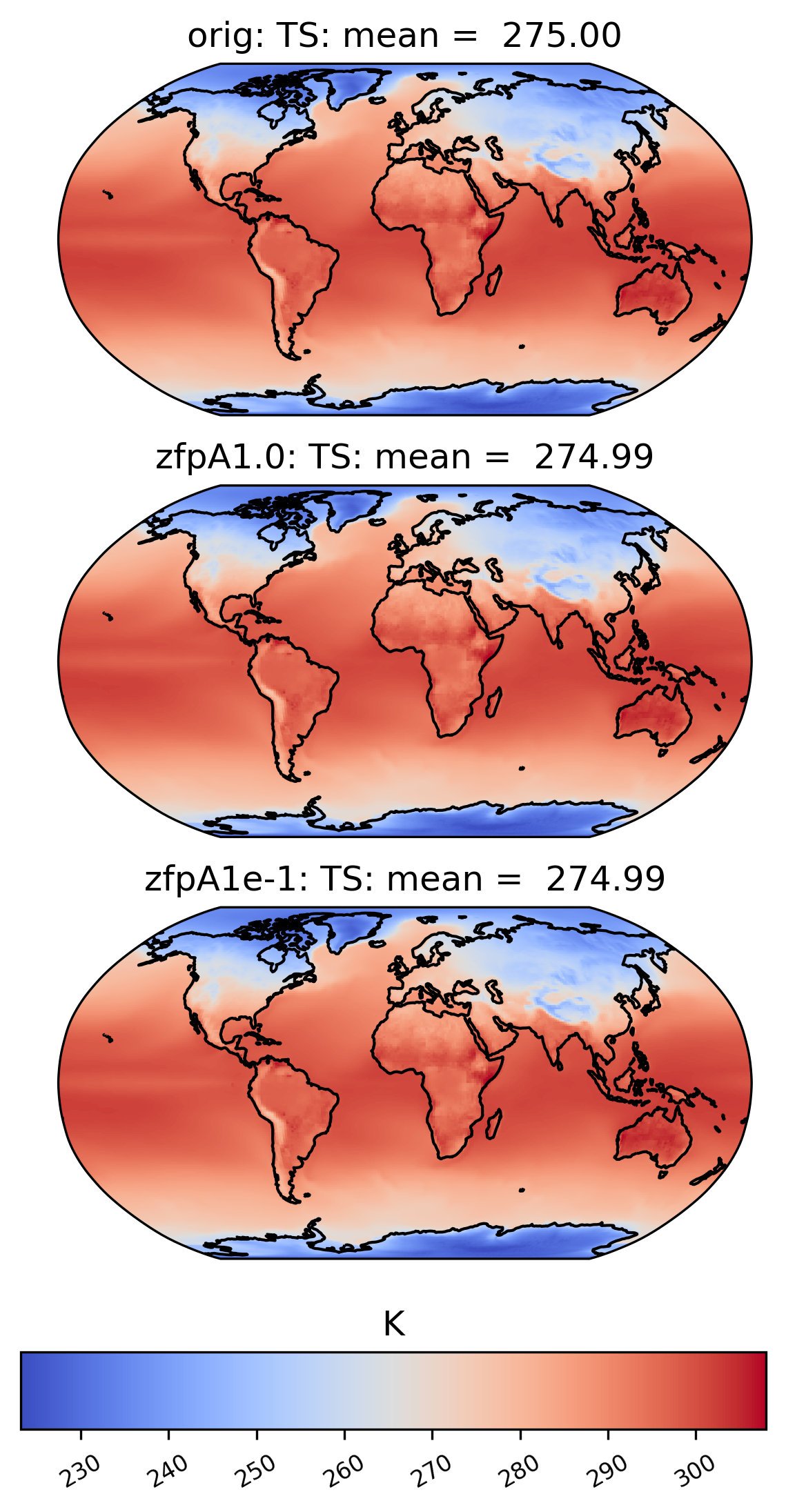
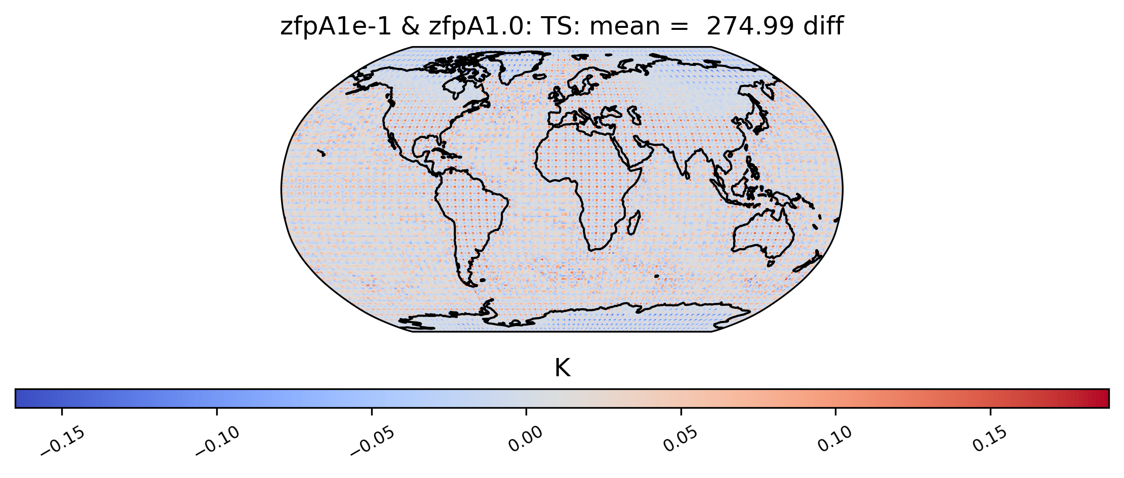
To the eye, these plots look identical. This is because the effects of compression are small compared to the magnitude of the data. We can view the compression artifacts more clearly by plotting the difference between two plots. This can be done by setting the calc_type to ‘diff’:
[12]:
# diff between mean TS values in col_ds "orig" and "zfpA1.0" datasets
ldcpy.plot(
    col_ts,
    "TS",
    sets=["orig", "zfpA1.0", "zfpA1e-1"],
    calc="mean",
    calc_type="diff",
)
We are not limited to comparing side-by-side plots of the original and compressed data. It is also possible to compare two different compressed datasets side-by-side as well, by using a different dataset name for the first element in sets:
[13]:
# comparison between variance of TS values in col_ts for "zfpA1e-1" and "zfpA1.0 datasets"
ldcpy.plot(col_ts, "TS", sets=["zfpA1e-1", "zfpA1.0"], calc="variance")
[14]:
# diff between mean TS values in col_ts for "zfpA1e-1" and "zfpA1.0" datasets
ldcpy.plot(
    col_ts,
    "TS",
    sets=["zfpA1e-1", "zfpA1.0"],
    calc="mean",
    calc_type="diff",
)
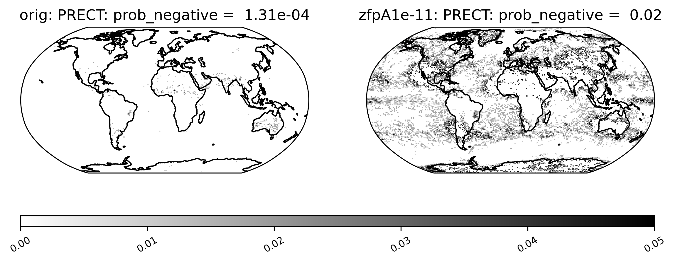
Sometimes comparison plots can look strikingly different, indicating a potential problem with the compression. This plot shows the probability of negative rainfall (PRECT). We would expect this quantity to be zero everywhere on the globe (because negative rainfall does not make sense!), but the compressed output shows regions where the probability is significantly higher than zero:
[15]:
ldcpy.plot(
    col_prect,
    "PRECT",
    sets=["orig", "zfpA1e-11"],
    calc="prob_negative",
    color="binary",
)
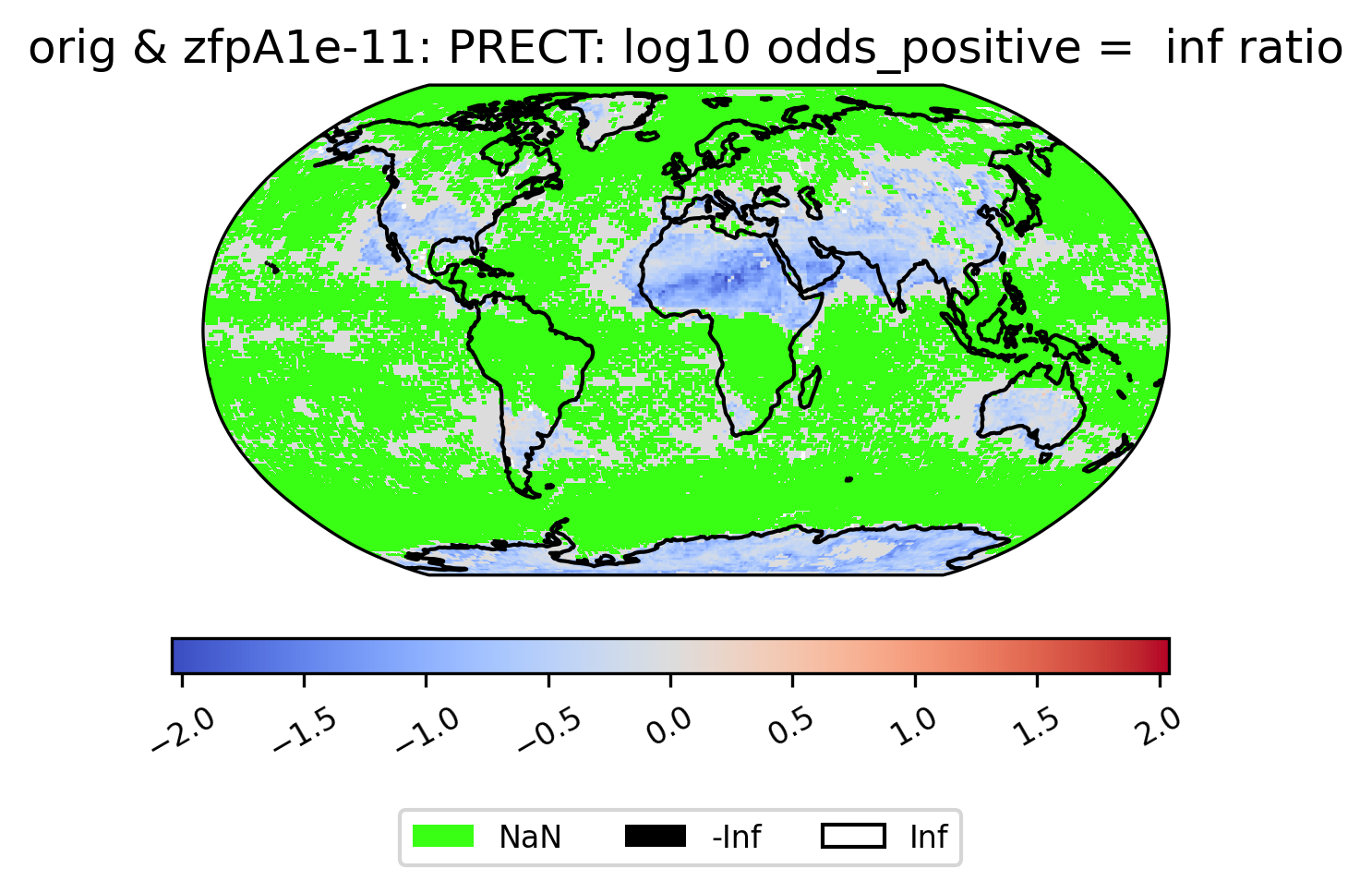
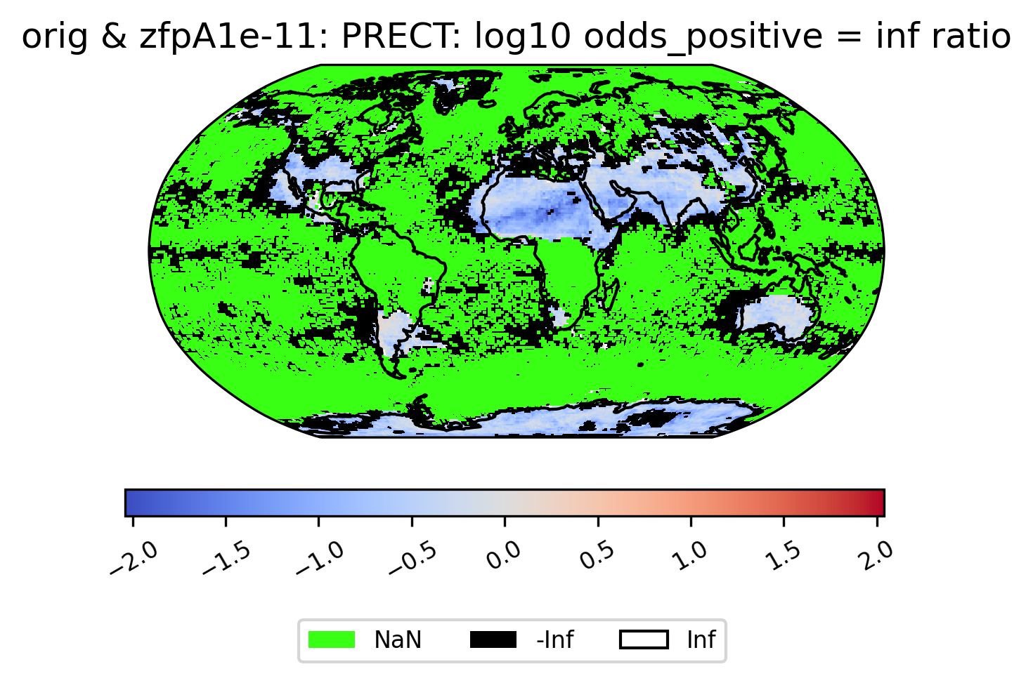
Unusual Values (inf, -inf, NaN)
Some derived quantities result in values that are +/- infinity, or NaN (likely resulting from operations like 0/0 or inf/inf). NaN values are plotted in neon green, infinity is plotted in white, and negative infinity is plotted in black (regardless of color scheme). If infinite values are present in the plot data, arrows on either side of the colorbar are shown to indicate the color for +/- infinity. This plot shows the log of the ratio of the odds of positive rainfall over time in the compressed and original output, log(odds_positive compressed/odds_positive original). Here we are suppressing all of the divide by zero warnings for aesthetic reasons.
The following plot showcases some interesting plot features. We can see sections of the map that take NaN values, and other sections that are black because taking the log transform has resulted in many points with the value -inf:
[16]:
# plot of the ratio of odds positive PRECT values in col_prect zfpA1e-11 dataset / col_prect orig dataset (log transform)
ldcpy.plot(
    col_prect,
    "PRECT",
    sets=["orig", "zfpA1e-11"],
    calc="odds_positive",
    calc_type="ratio",
    transform="log",
    axes_symmetric=True,
    vert_plot=True,
)
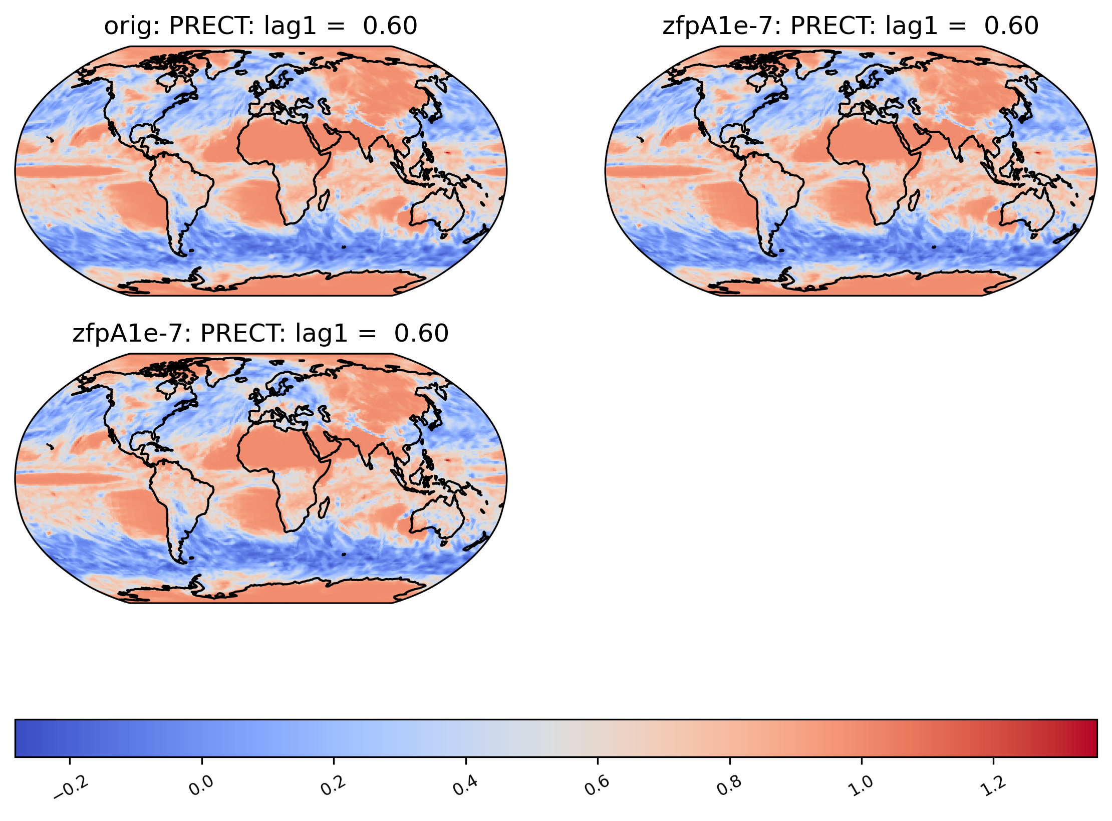
If all values are NaN, then the colorbar is not shown. Instead, a legend is shown indicating the green(!) color of NaN values, and the whole plot is colored gray. (If all values are infinite, then the plot is displayed normally with all values either black or white). Because the example dataset only contains 60 days of data, the deseasonalized lag-1 values and their variances are all 0, and so calculating the correlation of the lag-1 values will involve computing 0/0 = NaN:
[18]:
# plot of lag-1 correlation of PRECT values in col_prect orig dataset
ldcpy.plot(col_prect, "PRECT", sets=["orig", "zfpA1e-7", "zfpA1e-7"], calc="lag1")
Other Spatial Plots
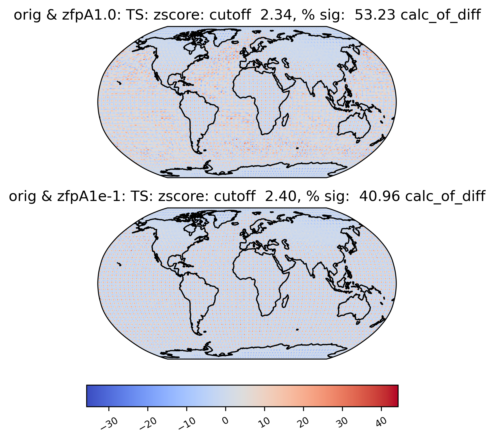
Sometimes, we may want to compute a quantity on the difference between two datasets. For instance, the zscore calculation calculates the zscore at each point under the null hypothesis that the true mean is zero, so using the “calc_of_diff” calc_type calculates the zscore of the diff between two datasets (to find the values that are significantly different between the two datasets). The zscore calculation in particular gives additional information about the percentage of significant gridpoints in the plot title:
[19]:
# plot of z-score under null hypothesis that "orig" value= "zfpA1.0" value
ldcpy.plot(
    col_ts,
    "TS",
    sets=["orig", "zfpA1.0", "zfpA1e-1"],
    calc="zscore",
    calc_type="calc_of_diff",
    vert_plot=True,
)
Time-Series Plots
We may want to aggregate the data spatially and look for trends over time. Therefore, we can also create a time-series plot of the calculations by changing the plot_type to “time_series”. For time-series plots, the quantity values are on the y-axis and the x-axis represents time. We are also able to group the data by time, as shown below.
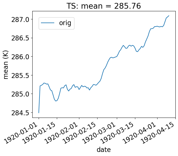
Basic Time-Series Plot
In the example below, we look at the ‘orig’ TS data in collection col_ts , and display the spatial mean at each day of the year (our data consists of 100 days).
[20]:
# Time-series plot of TS mean in col_ts orig dataset
ldcpy.plot(
    col_ts,
    "TS",
    sets=["orig"],
    calc="mean",
    plot_type="time_series",
    vert_plot=True,
    legend_loc="best",
)
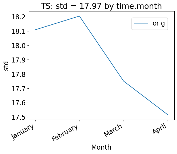
Using the group_by keyword
To group the data by time, use the “group_by” keyword. This plot shows the mean standard deviation over all latitude and longitude points for each month. Note that this plot is not too interesting for our sample data, which has only 100 days of data.
[21]:
# Time-series plot of TS standard deviation in col_ds "orig" dataset, grouped by month
ldcpy.plot(
    col_ts,
    "TS",
    sets=["orig"],
    calc="std",
    plot_type="time_series",
    group_by="time.month",
    vert_plot=True,
)
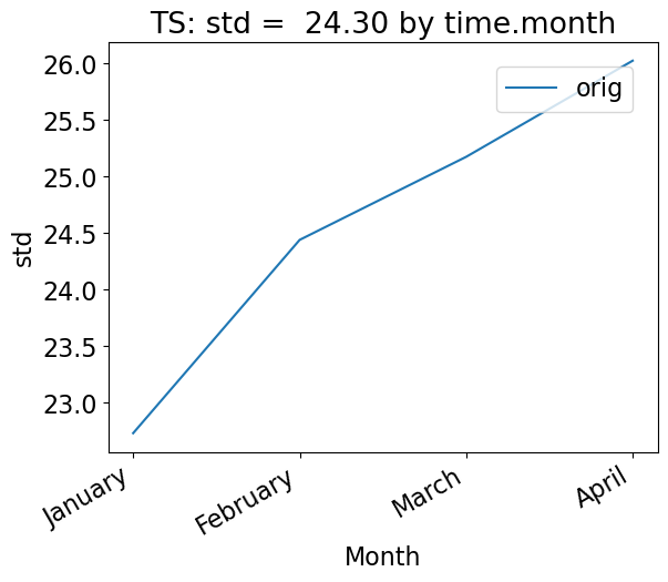
One could also group by days of the year, as below. Again, because we have less than a year of data, this plot looks the same as the previous version. However, this approach would be useful with data containing multiple years.
[22]:
# Time-series plot of TS mean in col_ts "orig" dataset, grouped by day of year
ldcpy.plot(
    col_ts,
    "TS",
    sets=["orig", "zfpA1.0"],
    calc="mean",
    calc_type="calc_of_diff",
    plot_type="time_series",
    group_by="time.dayofyear",
)
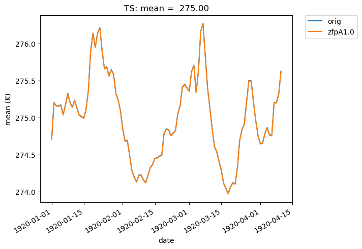
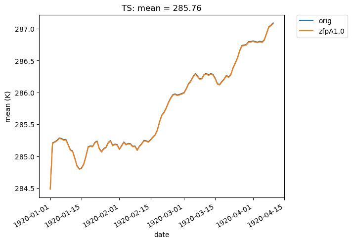
We can also overlay multiple sets of time-series data on the same plot. For instance, we can plot the mean of two datasets over time. Note that the blue and orange lines overlap almost perfectly:
[23]:
# Time-series plot of TS mean in col_ts 'orig' dataset
ldcpy.plot(
    col_ts,
    "TS",
    sets=["orig", "zfpA1.0"],
    calc="mean",
    plot_type="time_series",
)
If we change the calc_type to “diff”, “ratio” or “calc_of_diff”, the first element in sets is compared against subsequent elements in the sets list. For example, we can compare the difference in the mean of two compressed datasets to the original dataset like so:
[24]:
# Time-series plot of TS mean differences (with 'orig') in col_ts orig dataset
ldcpy.plot(
    col_ts,
    "TS",
    sets=["orig", "zfpA1.0", "zfpA1e-1"],
    calc="mean",
    plot_type="time_series",
    calc_type="diff",
)
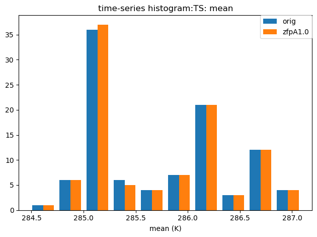
Histograms
We can also create a histogram of the data by changing the plot_type to ‘histogram’. Note that these histograms are currently generated from time-series quantity values (a histogram of spatial values is not currently available).
The histogram below shows the mean values of TS in the ‘orig’ and ‘zfpA1.0’ datasets in our collection col_ts. Recall that this dataset contains 100 timeslices.
[25]:
# Histogram of mean TS values in the col_ts (for'orig' and 'zfpA1.0') dataset

ldcpy.plot(
    col_ts,
    "TS",
    sets=["orig", "zfpA1.0"],
    calc="mean",
    plot_type="histogram",
)
Other Time-Series Plots
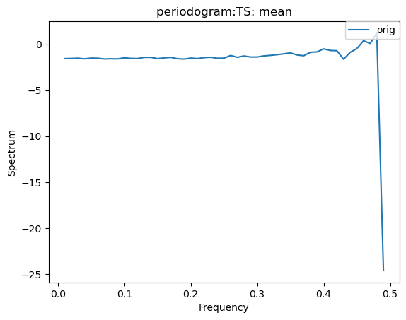
We can create a periodogram based on a dataset as well, by specifying a plot_type of “periodogram”.
[26]:
ldcpy.plot(col_ts, "TS", sets=["orig"], calc="mean", plot_type="periodogram")
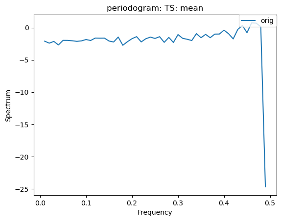
[27]:
ldcpy.plot(col_ts, "TS", sets=["orig"], calc="mean", plot_type="periodogram")
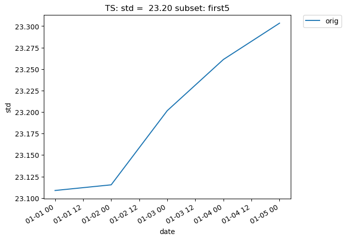
Subsetting
Subsetting is also possible on time-series data. The following plot makes use of the subset argument, which is used to plot derived quantities on only a portion of the data. A full list of available subsets is available here. The following plot uses the ‘first5’ subset, which only shows the quantity values for the first five time slices (in this case, days) of data:
[28]:
# Time-series plot of first five TS standard deviations in col_ts "orig" dataset
ldcpy.plot(
    col_ts,
    "TS",
    sets=["orig"],
    calc="std",
    plot_type="time_series",
    subset="first5",
)
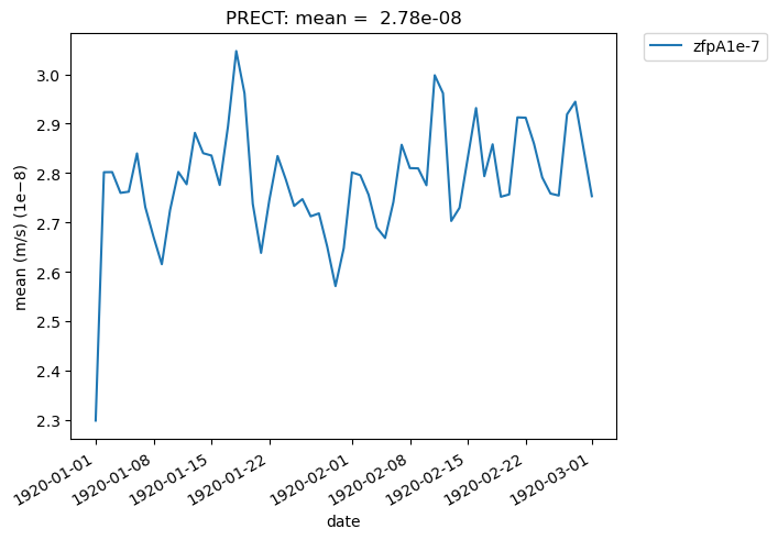
Additionally, we can specify “lat” and “lon” keywords for time-series plots that give us a subset of the data at a single point, rather than averaging over all latitudes and longitudes. The nearest latitude and longitude point to the one specified is plotted (and the actual coordinates of the point can be found in the plot title). This plot, for example, shows the difference in mean rainfall between the compressed and original data at the location (44.76, -123.75):
[29]:
# Time series plot of PRECT mean data for col_prect "zfpA1e-7" dataset at the location (44.76, -123.75)

ldcpy.plot(
    col_prect,
    "PRECT",
    sets=["zfpA1e-7"],
    calc="mean",
    plot_type="time_series",
    lat=44.76,
    lon=-123.75,
)
[30]:
# Time series plot of PRECT mean data for col_prect "zfpA1e-7" dataset at the location (44.76, -123.75)

ldcpy.plot(col_prect, "PRECT", sets=["zfpA1e-7"], calc="mean", plot_type="time_series")
It is also possible to plot quantities for a subset of the data, by specifying the start and end indices of the data we are interested in. This command creates a time-series plot of the mean TS values for the first 45 days of data:
[31]:
# Time series plot of first 45 TS mean data points for col_ts "orig" dataset

ldcpy.plot(
    col_ts,
    "TS",
    sets=["orig"],
    calc="mean",
    start=0,
    end=44,
    plot_type="time_series",
)
Derived quantities
We can also generate derived quantities on a particular dataset. While this is done “behind the scenes” with the plotting functions, we first demonstrate here how the user can access this data without creating a plot.
We use an object of type ldcpy.Datasetcalcs to gather calculations derived from a dataset. To create an ldcpy.DatasetMetircs object, we first grab the particular dataset from our collection that we are interested in (in the usual xarray manner). For example, the following will grab the data for the TS variable labeled ‘orig’ in the col_ts dataset that we created:
[32]:
# get the orig dataset
my_data = col_ts["TS"].sel(collection="orig")
my_data.attrs["data_type"] = col_ts.data_type
my_data.attrs["set_name"] = "orig"
Then we create a Datasetcalcs object using the data and a list of dimensions that we want to aggregate the data along. We usually want to aggregate all of the timeslices (“time”) or spatial points (“lat” and “lon”):
[33]:
ds_calcs_across_time = ldcpy.Datasetcalcs(my_data, "cam-fv", ["time"])
ds_calcs_across_space = ldcpy.Datasetcalcs(my_data, "cam-fv", ["lat", "lon"])
Now when we call the get_calc() method on this class, a quantity will be computed across each of these specified dimensions. For example, below we compute the “mean” across time.
[34]:
my_data_mean_across_time = ds_calcs_across_space.get_calc_ds("mean", "m")

# trigger computation
my_data_mean_across_time
[34]:
<xarray.Dataset> Size: 2kB
Dimensions:     (time: 100)
Coordinates:
  * time        (time) object 800B 1920-01-01 00:00:00 ... 1920-04-10 00:00:00
    collection  <U8 32B 'orig'
Data variables:
    m           (time) float64 800B dask.array<chunksize=(1,), meta=np.ndarray>
Attributes:
    units:          K
    long_name:      Surface temperature (radiative)
    cell_methods:   time: mean
    data_type:      cam-fv
    set_name:       orig
    weighted:       True
cell_measures: area: cell_area[35]:
# Here just ask for the spatial mean at the first time step
my_data_mean_across_space = ds_calcs_across_space.get_calc("mean").isel(time=0)
# trigger computation
my_data_mean_across_space.load()
[35]:
<xarray.DataArray 'TS' ()> Size: 8B
array(284.48966513)
Coordinates:
    time        object 8B 1920-01-01 00:00:00
    collection  <U8 32B 'orig'
Attributes:
    units:          K
    long_name:      Surface temperature (radiative)
    cell_methods:   time: mean
    data_type:      cam-fv
    set_name:       orig
    weighted:       True
cell_measures: area: cell_areaThere are many currently available quantities to choose from. A complete list of derived quantities that can be passed to get_calc() is available here.
[ ]:
[ ]: